Saturday, December 17, 2011

HTML5 Native Drag ‘n’ Drop

HTML5 does not only mean a whole new world of tags (video, audio, header, footer, article, section etc.) and revolutionary technologies like Geolocation, Application cache, Canvas, Web Workers etc. but it also brings along a rich set of JavaScript API to developers.

Today, we witness one of the interesting feature that it provides; the capability of dragging and dropping elements natively without using any JS framework. The HTML5 spec defines the new events that we should catch in order to handle operations like

  1. Start of drag operation ( dragstart )
  2. Dragging content over another element ( dragover )
  3. Entering the drag area of another element ( dragenter )
  4. End of Drag operation ( drop )

If you have worked with a RIA-friendly language such as ActionScript, then you will found this to be very similar. Having said that, providing this drag and drop support in the browser itself is the reason behind the fame of HTML5.

Coming back, lets see some code in action. We have some images in our page which we want to drag and drop in div container. These images are tagged with class “dragMe” (so that we can attach event listeners to them). Similarly, we have a div container in which we are going to drop these images with an id of “dropOnMe”.

htmlCode

Things to note

  • draggable=true  -  By default, images and links are draggable in nature but I have added this attribute just to convey that any HTML5 element can be selected, dragged and dropped if you add this attribute to it. Also add following CSS to make it work across different browsers

draggableTrueCss

  • Custom data-* attributes  -  Again something, HTML5-blessed. It provides us the capability to define custom data-attributes on any element. Here we use it to define properties of individual images. More on custom data-attributes here.

Next, we add some event handlers to handle drag n drop related events we defined above:

1. Adding Drag Handlers

dragStart

We took a hold of all the elements that are to be dragged and attach to each, a drag handler which will be called whenever you click and try to drag that elements. In the handler, we update the event’s dataTransfer object and set custom properties in the JavaScript object, which we defined in the markup  (yes you guessed it right, we are going to use them in the drop handler)

2. Adding Drop Handlers

dropHandler

Note that we use both e.preventDefault() and return false in the function, to make it work across different browsers; this is needed to make sure that we cancel the default action that the browser will normally take, like surfing to that location (in case of a link). Apart from that, the code just retrieves the data set in dataTransfer object and display that using innerHTML of the div.

3. Adding handlers for dragover & dragenter

dragOverEnterHandlers

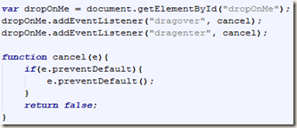
Again for making the code work across different browsers (tested on Firefox, IE and Chrome), we need to use both preventDefault() and also return false from the handler in order to inform the browser that you can drop and release the dragged item on this element for which the function is called.

A Lot More…

..can be achieved like customizing the drag icon and even drag and drop across different instances of same browser or even dragging from one browser and dropping in another browser. Stay tuned or check out the spec for more details.

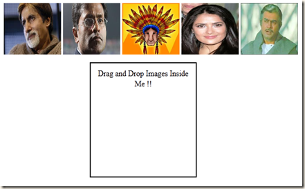
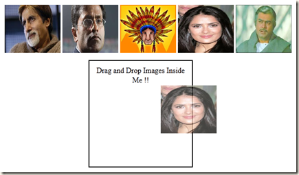
Final Demo Looks like

Too bad that I don’t have a proper hosting solution, so you have to do with images, until you are passionate enough to write the above code yourself.

Initial Screen

image

Dragging an Item

image

Dropped it !!

image

We can add more spice to the tut by adding CSS and some other effects but in the hope that it would overshadow the concept, I emphasize on the minimal code needed for it.

Any suggestions, improvements or bugs are welcome as comments.

Saturday, November 19, 2011

CSS3 Media Queries

Need of Media Queries

Gone were those days when designers had the liberty to design or layout a web page for fixed/minimum resolution as most people would just use their desktop for browsing the web. In this mobile/tablet era, we cannot assume that the desktop would be the only user agent. A large number of users today use their “smartphones” or “tablets” for browsing the web and so it becomes crucial that your website looks as good when viewed from such a device.

Many websites today have different version of websites, one each for desktop and mobile. By detecting the user agent when the user visits the website for the first time, it can redirect them to the mobile version if he is browsing the web using his smartphone. But this solution comes with its own headache of maintaining separate presentation layers for separate mediums and fixing bugs in both !!

This is where Media Queries come into picture. They provide an elegant solution to the problem by providing the ability to switch the CSS based on the user agent or device’s width or orientation. In short, they make your web design adaptive and responsive to change.

Wow, that’s new !!

Not really !!. They were very much a part of CSS2 and HTML4 specification where they were limited to ‘print’ and ‘screen’ only (meaning using CSS2, you can only specify different style-sheets for rendering and printing a web page). But with CSS3, more media types are supported and different style-sheets can be applied based on

  • device-width and height
  • viewport-width and height
  • orientation
  • aspect-ratio
  • device aspect-ratio
  • resolution etc..

Without wasting more time, lets see an example. We will create a layout for a widescreen (desktop layout) and using media queries, we will change the layout and color the markup when we resize the browser (to simulate tablet and mobile size)

wideLayout Layout for Wide Screen

tabletLayout Layout for Tablet or Not So Wide Screen

phoneLayout Layout for a Mobile Device

In this lame-example, we have simple created a three-column layout for a widescreen or desktop, and changed it to a two-column layout for a tablet and coloured the sidebar blue (not to show my design skills of course, but to distinguish between the layouts) and then a stacked layout for a mobile device with red coloured div. and All this by simply switching the CSS for the same HTML file. All the code is explained below:

index.html

<!DOCTYPE HTML>
<head>

<meta name="viewport" content="width=device-width, initial-scale=1">
<meta charset="UTF-8" />
<link media="only screen and (min-width: 800px)" rel="stylesheet" href="css/desktop.css" />
<link media="only screen and (min-width: 400px) and (max-width: 800px)" rel="stylesheet" href="css/tablet.css" />
<link media="only screen and (max-width: 400px)" rel="stylesheet" href="css/phone.css" />

</head>
<body>

<div id="header"> Header </div>
<div id="sideBar"> Side Bar </div>
<div id="content"> Content </div>
<div id="extra"> Extra </div>

</body>
</html>

desktop.css

div
{
border: 1px solid;
}
body
{
width:1000px;
margin: auto;
}
#sideBar
{
float:left;
width:250px;
height:600px;
}
#content
{
float:left;
width:448px;
height:600px;
}
#extra
{
margin-left:700px;
width:296px;
height:600px;
}

tablet.css

div
{
border: 1px solid;
}
body
{
width:700px;
margin: auto;
}
#sideBar
{
float:left;
width:200px;
height:600px;
background-color:blue;
}
#content
{
margin-left:202px;
height:600px;
}
#extra
{
clear:both;
}

phone.css

div
{
border: 1px solid;
}
body
{
width:350px;
margin: auto;
}
#sideBar
{
height:100px;
}
#content
{
height:100px;
background-color:red;
}
#extra
{
height:100px;
}

This HTML files simple contains 4 Div’s in the body and head contains links to some style-sheets with media queries using link tag, lets see what these queries mean

<link rel="stylesheet" href="css/desktop.css" media="only screen and (min-width: 800px)" />

It can be read as include the “desktop.css” file if and only if the user agent has a screen and the minimum-width of the device is 800 pixels. Similarly,

<link rel="stylesheet" href="css/tablet.css" media="only screen and (min-width: 400px) and (max-width: 800px)" />

it says that include the “tablet.css” when the user agent has a screen and its width is between 400 to 800 pixels, something that we think should be suitable for a tablet.

<link rel="stylesheet" href="css/phone.css" media="only screen and (max-width: 400px)" />

On the same lines, in this rule, we ask the browser to use “phone.css” if the width is less than 400 pixels. Note that these rules are mutually exclusive because we want them to be like so. Each rule must evaluate to a boolean value and depending on that value, the CSS file is downloaded to the client machine and is used for rendering the HTML markup.

You can also embed the media-query inline in the CSS as follows:

<style type="text/css">       
@media only screen and (max-width: 400px)
{
#content
{
height:100px;
background-color:red;
}
}
</style>

Orientation

Similarly the CSS for phone.css can be broken down into two parts: phonePortrait.css and phoneLandscape.css by applying the following media queries

<link media="only screen and (max-width=400px) and (orientation=portrait)" rel="stylesheet" href="phonePortrait.css" />
<link media="only screen and (max-width=400px) and (orientation=landscape)" rel="stylesheet" href="phoneLandscape.css" />

Width Vs Device-width

"width" refers to the width of the viewport width (or the browser’s width) whereas the "device-width" refers to the width of the device (for desktop users, it is the dimensions of the monitor used, for mobile users, it is the dimensions of the smartphone used). Common sense says we should use device as the browser size may be less than the dimension of the device (esp on desktop)

The complication comes in case of mobiles, where the likes of iDevices and Androids incorrectly reports the viewport-width and also neglects the orientation of the device while calculating the width. To make things work, Apple introduced a new meta-tag: Viewport which is usually used as follows:

<meta name="viewport" content="width=device-width, initial-scale=1">

This instructs the device to report the viewport width equal to the actual width of the device and also take orientation into account while making that calculation. More details can be read here.

Browser Support

Surprisingly, majority of browsers do support media queries but for those who don’t, a JavaScript workaround can be applied which based on the width of the browser, changes the link’s href value to point to the correct CSS file.

Spec

A lot more can be achieved by media queries, all of which has been laid out in the spec here.

Disclaimer

The HTML & CSS used above in the example are merely for demonstrating the power of Media Queries and hence have been intentionally kept lame.

Tuesday, November 15, 2011

Remembering the old Sunny Days

Although my tenure with Sun Microsystems (now Oracle Corp), working as a Sun Campus Ambassador was numbered (just 6 months), but I consider that to be an important phase in my life, a beginning of a new journey, something that motivated me to work on open-source technology and learn new and exciting stuff.

The bad, rather the ugly part is that I cannot access my Sun Blog anymore !! Yes, I have written to Oracle about it, but nothing has happened so far. Still the sole purpose of writing that post was to re-live moments of the past and  thanks to Arun Gupta, I’m re-posting one of my favourite entries again: A poem for me from one of my favourite professor: Dr. P.K. Hazra.

Under the SUN-MICROSYS SunRay
Has bloomed a Lovely Rose,
Over Joyful in Java & Solaris
He is SUN CAMPUS AMBASSADOR Agraj.
Only one request I want to make
to the SUN's shining flower,
To remain in serene silence
During my lecture hour
                Quoted by Dr. P.K Hazra

and As they say,  “I’m really gonna miss this place, I’m gonna my college days…”

Saturday, November 12, 2011

jQuery Mobile: Hello Mobile World

After more than one year of online-hibernation, I’m more than happy to be back and today would be writing about creating a basic mobile application using jQuery Mobile.

Overview

jQuery Mobile provides a robust framework to develop mobile applications on the fly and is as simple as creating a HTML page and including jQuery mobile specific JS and CSS files. The framework is not only pretty straightforward to use, but also provides a familiar approach for web developers (who are already comfortable with HTML, CSS & Javascript/jQuery). It also provides 5 predefined themes to choose from and recently ThemeRoller has been launched which can be used to create a custom theme for your app. Fortunately for you guys, I’m not going to rant about how awesome jQuery Mobile is, as all that can be found here. :-)

Getting Started

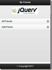
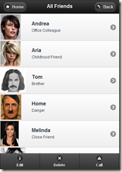
In this post, we will be creating a basic contacts app which looks like below:

homePage allFriendsView

addNewFriend

Lets start by creating a basic html file (index.html) for the home page/the first view and add the code below to it:

<!DOCTYPE html>
<html>
<head>
<meta charset="utf-8">
<title>My Friends</title>
<link href="jquery-mobile/jquery.mobile-1.0a3.min.css" rel="stylesheet" type="text/css"/>
<script src="jquery-mobile/jquery-1.5.min.js" type="text/javascript"></script>
<script src="jquery-mobile/jquery.mobile-1.0a3.min.js" type="text/javascript"></script>
<link href="css/styles.css" rel="stylesheet" type="text/css">
</head>
<body>
<div data-role="page" id="page">
<div data-role="header">
<h1>My Friends</h1>
</div>
<div data-role="content">
<!-- Logo -->
<div id="logo"> </div>
<ul data-role="listview">
<li><a href="allFriends.html" data-transition="pop">All Friends</a></li>
<li><a href="addFriend.html" data-transition="fade">Add Friend</a></li>
</ul>
</div>
<div data-role="footer" data-position="fixed">
<h4>&copy; Copyright 2011</h4>
</div>
</div>
</body>
</html>

In the head section, we have included jQuery mobile specific CSS and JS files. We have also included our custom CSS file: styles.css which is primarily used to position the logo for our application and consists of the following code:

#page div #logo {
width: 300px;
height: 100px;
background-image: url(../images/jQueryLogo.jpg);
background-repeat: no-repeat;
background-position: center 0px;
margin-top: 0px;
margin-right: auto;
margin-bottom: 0px;
margin-left: auto;
}

The body contains various div’s which form one view/page of the mobile app. The “page” div usually contains “header”, “content” and a “footer”. These div’s can then contain anything that you want to put inside those sections of the page (following some conventions).

As the name suggests, header and footer are the blocks at top and bottom of the page and the “content” div is used to lay out the elements to be shown in the rest of page. Here, we show a logo and list view of 2 elements.

As you might have noticed we have made extensive use of HTML5 custom data-attributes (the data-* attributes on HTML tags) throughout our tutorial. jQuery mobile leverages this uber cool feature of HTML5 to add capabilities to its framework. These custom data-attributes (like data-role, data-transition, data-position etc) are defined in jQuery Mobile framework and support predefined values.

Lets create another pages/html files, which we will then link to our main page (index.html). Creating the second view/page (allFriends.html) in which we will show all the friends in our list.

<!DOCTYPE HTML>
<html>
<head>
<meta charset="utf-8">
<title>All Friends</title>
<link href="jquery-mobile/jquery.mobile-1.0a3.min.css" rel="stylesheet" type="text/css"/>
<script src="jquery-mobile/jquery-1.5.min.js" type="text/javascript"></script>
<script src="jquery-mobile/jquery.mobile-1.0a3.min.js" type="text/javascript"></script>
</head>

<div data-role="page">
<div data-role="header">
<a href="index.html" data-icon="home"> Home </a>
<h1> All Friends</h1>
<a href="index.html" data-icon="back"> Back </a>
</div>

<div data-role="content">
<ul data-role="listview">
<li> <a href="friendDetails.html">
<img src="images/face1.jpg">
<h3> Andrea </h3>
<p> Office Colleague </p>
</a>
</li>
<li> <a href="friendDetails.html">
<img src="images/face2.jpg">
<h3> Aria </h3>
<p> Childhood Friend </p>
</a>
</li>
<li> <a href="friendDetails.html">
<img src="images/face3.jpg">
<h3> Tom </h3>
<p> Brother </p>
</a>
</li>
<li> <a href="friendDetails.html">
<img src="images/face4.jpg">
<h3> Home </h3>
<p> Danger </p>
</a>
</li>
<li> <a href="friendDetails.html">
<img src="images/face5.jpg">
<h3> Melinda </h3>
<p> Close Friend </p>
</a>
</li>
<li> <a href="friendDetails.html">
<img src="images/face6.jpg">
<h3> Taanya </h3>
<p> College </p>
</a>
</li>
<li> <a href="friendDetails.html">
<img src="images/face7.jpg">
<h3> Micheal </h3>
<p> Rockstar </p>
</a>
</li>
<li> <a href="friendDetails.html">
<img src="images/face8.jpg">
<h3> Maria </h3>
<p> Friend </p>
</a>
</li>
</ul>
</div>

<div data-role="footer" data-position="fixed">
<div data-role="navbar">
<ul>
<!-- Add icons here for Delete, Edit, Call Friend -->
<li><a href="#" data-icon="info" data-iconpos="top">Edit</a></li>
<li><a href="#" data-icon="delete" data-iconpos="top">Delete</a></li>
<li><a href="#" data-icon="alert" data-iconpos="top">Call</a></li>
</ul>
</div><!-- /navbar -->
</div><!-- /footer -->

</div>

<body>
</body>
</html>

By writing this small piece of code, we can show the thumbnails in the listview along with some description of each element. To make things simpler, this is simply some static data hardcoded into HTML. A real-world application would read this data from some persistence store and using jQuery would create this markup dynamically with that data.

jQuery Mobile also provides a rich set of form elements as can be read here. We create a simple form using the html below (addFriend.html) to show some basic form elements to create the third page/view of our app in which we provide a simple form to add a new friends in the existing contacts.

<!DOCTYPE HTML>
<html>
<head>
<meta charset="utf-8">
<title>Add Friend</title>
<link href="jquery-mobile/jquery.mobile-1.0a3.min.css" rel="stylesheet" type="text/css"/>
<script src="jquery-mobile/jquery-1.5.min.js" type="text/javascript"></script>
<script src="jquery-mobile/jquery.mobile-1.0a3.min.js" type="text/javascript"></script>
</head>
<body>
<div data-role="page">
<div data-role="header">
<a href="index.html" data-icon="home"> Home </a>
<h1> Add Friend </h1>
<a href="index.html" data-icon="back"> Back </a>
</div>
<div data-role="content">
<form action=”submit.jsp” method="post">
<div data-role="fieldcontain">
<label for="name">Name: </label>
<input type="text" name="name" id="name" placeholder="Enter Name"/>
</div>
<div data-role="fieldcontain">
<label for="gender">Gender:</label>
<select name="gender" id="gender" data-role="slider">
<option value="MALE">Male</option>
<option value="FEMALE">Female</option>
</select>
</div>
<div data-role="fieldcontain">
<label for="age">Age</label>
<input type="range" name="age" id="age" min="0" max="100" value="0"/>
</div>
<fieldset class="ui-grid-a">
<div class="ui-block-a">
<a href="index.html" data-role="button" id="cancel">Cancel</a>
</div>
<div class="ui-block-b">
<button type="submit" data-theme="a">Submit</button>
</div>
</fieldset>
</form>
</div>
<div data-role="footer" data-position="fixed">
<h4>&copy; Copyright 2011</h4>
</div>
</div>
</body>
</html>

Again the markup is pretty much similar to a normal HTML page, just we have used certain specific data-roles, specific classes which are defined in the framework to layout the elements in a certain fashion and apply a theme to our UI. Since this is just for introducing the framework and not on developing a fully functional app, so the form submission does not work, rather it gives an elegant error message on click of submit button as we have not provided a submit.jsp page to handle the request. (Done intentionally to show the elegant error handling of the framework)

Single-page template Vs Multiple-page templates

Here we have used one html file per page. We also have an option to keep multiple pages inside one html file. In that case, we need to give id to our pages and link them to each other accordingly using that id. But that can soon explode & become unmanageable, and is only recommended when there is some static data to be shown

CSS Layout Magic

We didn’t write much CSS still our HTML pages looks just like a mobile site and the “header”, “footer” and “content” data-roles are layout perfectly nice. It’s so because of the framework’s CSS file (jquery.mobile-1.0a3.min.css) which we have included in our HTML pages. Again proves what amazing things CSS can do :-)

Dreamweaver Integration with jQuery Mobile

Adobe has done a fantastic job in integrating jQuery Mobile with Dreamweaver and provides several templates to get you started. The editor also supports some level of code-completion for jQuery Mobile and even some support for Javascript.

Want to learn more ?

Even after writing such a long post, its hard to explain each line of code written above so the best way to learn more is to refer to the Docs. Or I might just write another post to explain some more.

Disclaimer

This is just an introduction to jQuery Mobile and might not follow the best practices like normally you would refer to jQuery framework files from some CDN than to include them with your own code. Also, the above code is static in nature, but it can be easily integrated with any database using some script and can form a fully-fledged application.

As always, comments and corrections are welcomed and appreciated.